


Data-driven content is one of the most effective forms of earning links. The reasons are simple:
- There is no shortage of interesting insights to find
- It’s tough to copy – nobody cares about the second person to come up with an insight
- Writing a 2,000 word article and begging for links ain’t what it used to be
- New data-driven insights are typically newsworthy
Data-driven content, along with the images, stats, graphs, and charts that come with it, is a great way to bake content promotion right into your article. It becomes much easier to build links when you have this differentiator.
Here are 8 examples of companies using data in one form or another to earn links and drive SEO traffic.
1. Thumbtack’s Annual Small Business Friendliness Survey
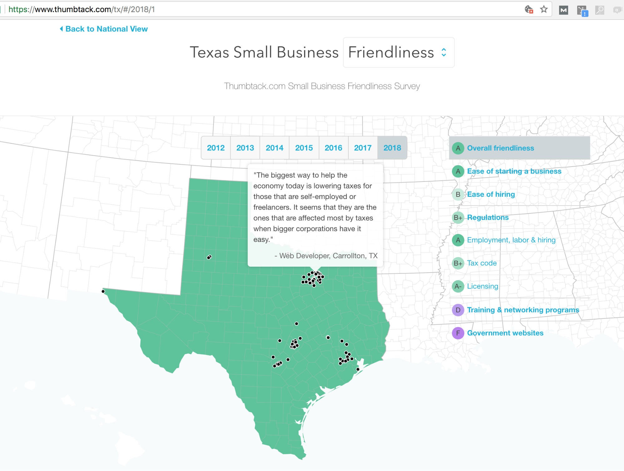
Thumbtack, founded in 2008, came to be an SEO giant in nearly every home services vertical by two tactics. Incentivising badges with anchor text and their annual small business friendliness survey. The latter is what we’ll focus on here.
Every year, Thumbtack incentivizes millions of small businesses on the platform to take a survey related to small business friendliness in their region. Thumbtack aggregates this data into results at state and city levels and assembles it onto a study on each of their state pages, and some of their city pages.
They then pitch the study to local newspapers and organizations, earning them thousands of links. Since the links point to state and city pages, the link equity and relevance passes onto Thumbtack’s local service pages, allowing them to rank in the top results for almost every service in every metro.
This link bait tactic economic study is so legitimate that the Governor of Utah went to Thumbtack’s office to receive an award.
Part of the brilliance of this tactic is that it can be reused every single year (Note how Thumbtack uses hashtags to trigger past year’s studies on their state-level pages.)
2. “Is Amazon actually giving you the best price” by Wikibuy
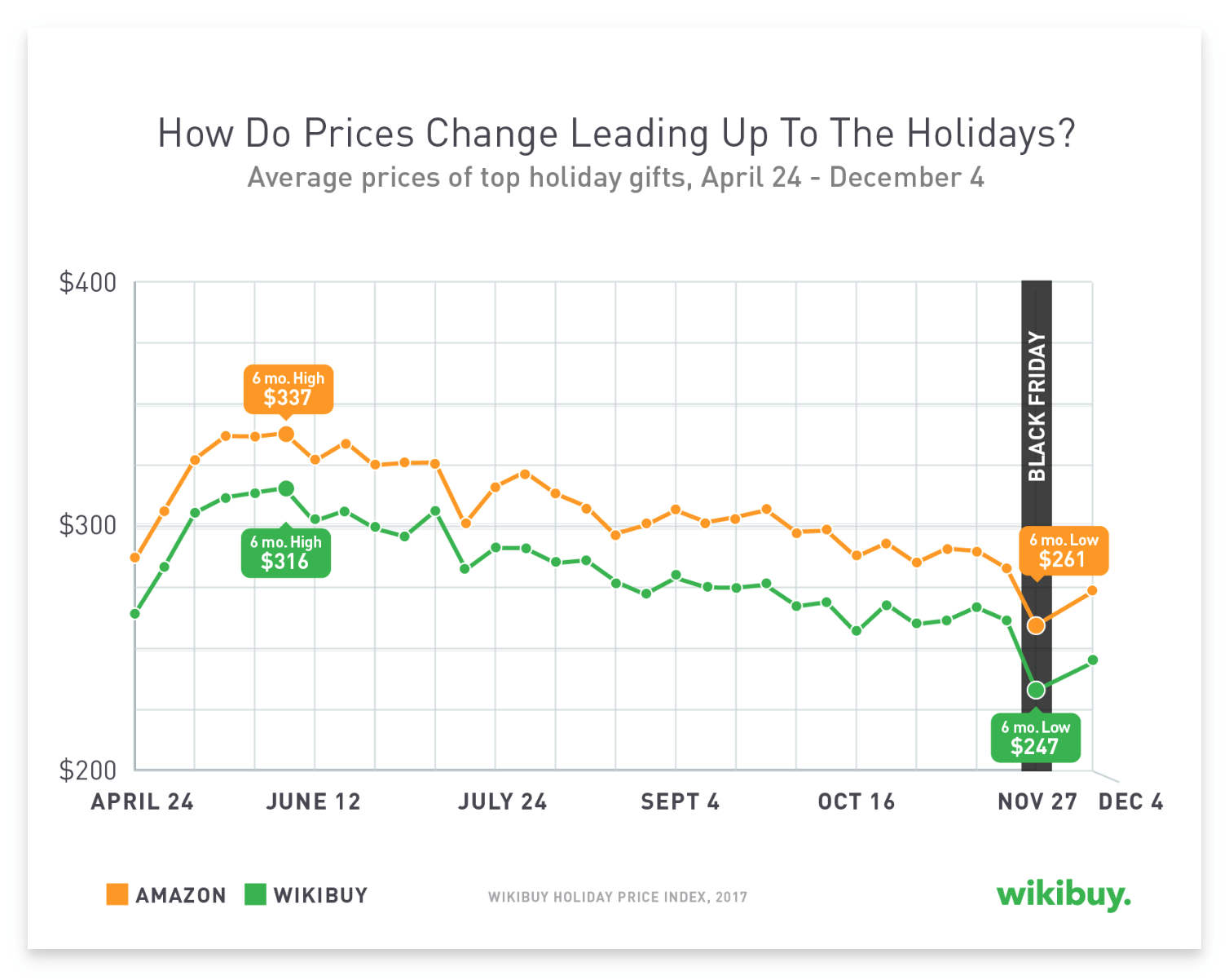
Wikibuy is a chrome extension that helps you find the lowest price on any item while shopping online. Around Black Friday of 2017, the company released a study that while customers did save on Black Friday, they could have saved more by shopping elsewhere.
The company created its own index of prices on Amazon compared to other prices that shoppers paid, showing a stark difference. In addition to backlinks, the company received widespread press coverage for this study, which couldn’t have come at a more opportune time than the holiday shopping season.
3. “Do Americans Know Basic Car Warning Symbols?” by the Zebra

The Zebra is a search engine for car insurance that gets nearly 10 million visitors per year, mostly from organic search, according to Similar Web.
That’s no small feat in a niche as competitive as insurance, especially since the company was founded in 2012 – long past the ‘glory days’ of aggregator style SEO.
How did they achieve this? Data-driven content plays a big role.
One of their most successful pieces, The State of Auto Insurance 2018, earned hundreds of links from sites ranging from personal finance blogs to local news stations.
It’s a pretty beautifully done piece, with a great UX and lots of interesting tidbits such as how much a speeding ticket will increase your insurance and how much it costs to insure different vehicles. According to the site, all data came from “[the Zebra’s] quote engine, comprising data from insurance rating platforms and public rate filings”.
Typically the challenge with presenting data is balancing digestibility with the quantity of data, and the Zebra clearly invested a great deal of time striking this balance.
One particular instance of this is the state view, which allows a user to check out their specific state. This makes the piece appealing to the thousands of local journalists in the US.
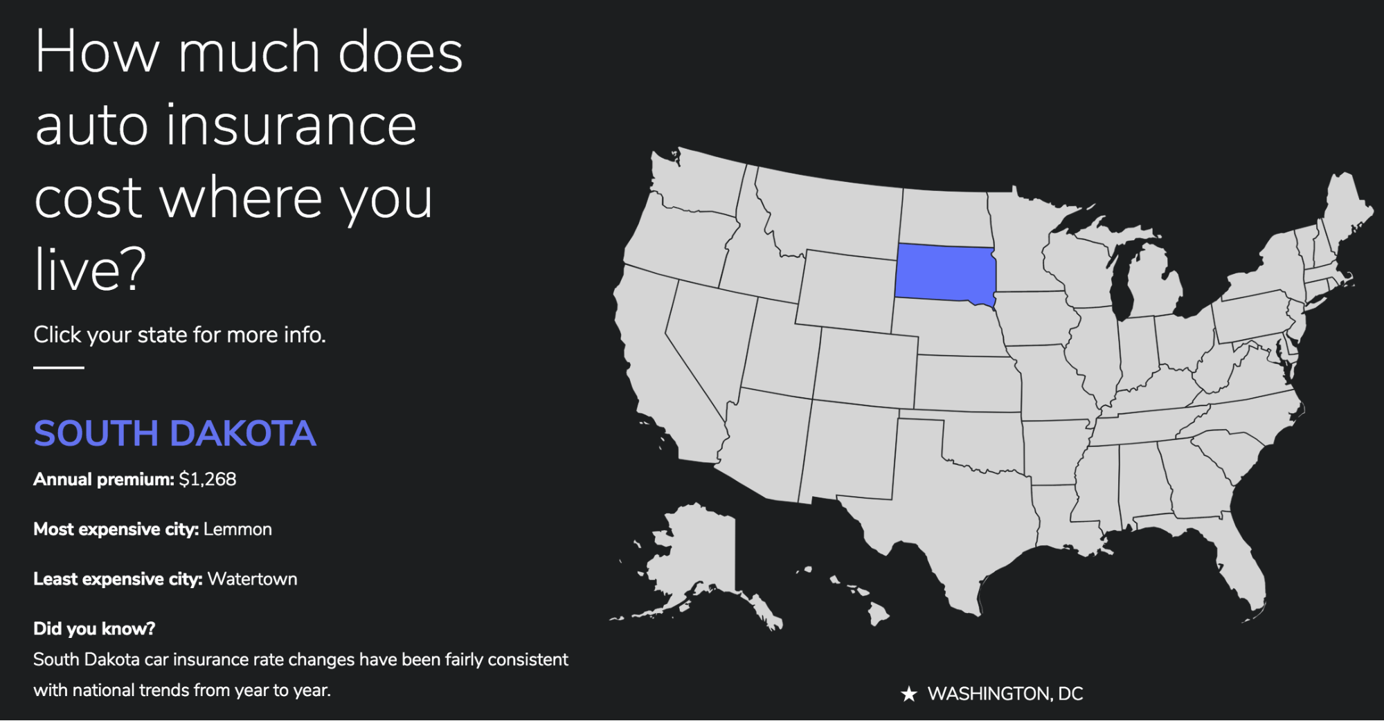
It’s really tough to do this visualization justice with screenshots, so I’d highly recommend checking it out.
4. “Is Fortnite becoming a relationship wrecker?” by Divorce Online
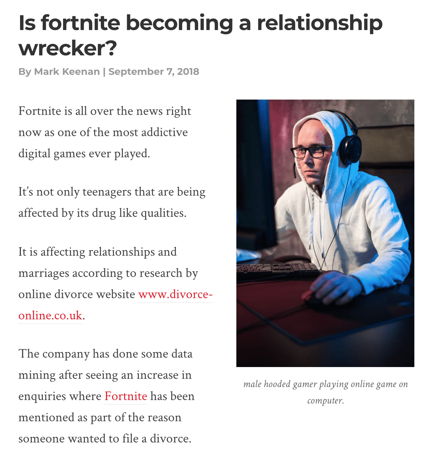
UK-based divorce service Divorce Online recently released a study of their own data indicating that 5% of divorce cases mentioned the word Fortnite. In case you aren’t aware, Fornite is a highly addicting computer game taking the world by storm.
By combining newsjacking and proprietary data, Divorce Online earned links and press from the likes of CNBC.
In contrast to the previous example from the Zebra, this piece of content is dead simple. The article is only 214 words and includes no data visualization or imagery other than a stock photo.
That’s because the statistic they cited is the entire story – no need to overdo it if you don’t have to.
5. “Where are the new residents of Denver, CO moving from?” by LawnStarter
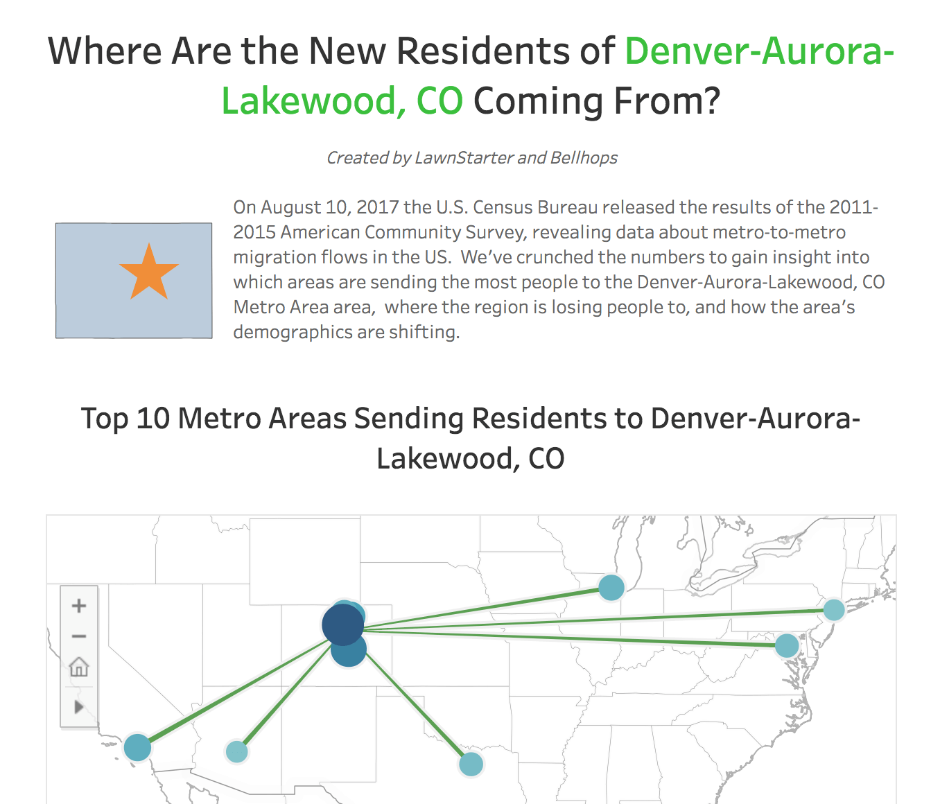
On August 2017, the US Census released a data-set showing metro-to-migration population flows in the United States. Not even a month later, LawnStarter turned this dataset into an interactive visualization showing exactly where new residents of Denver are moving from. The visualization shows several other tidbits such as where Denver lost population to, and what the demographics of the new population look like.
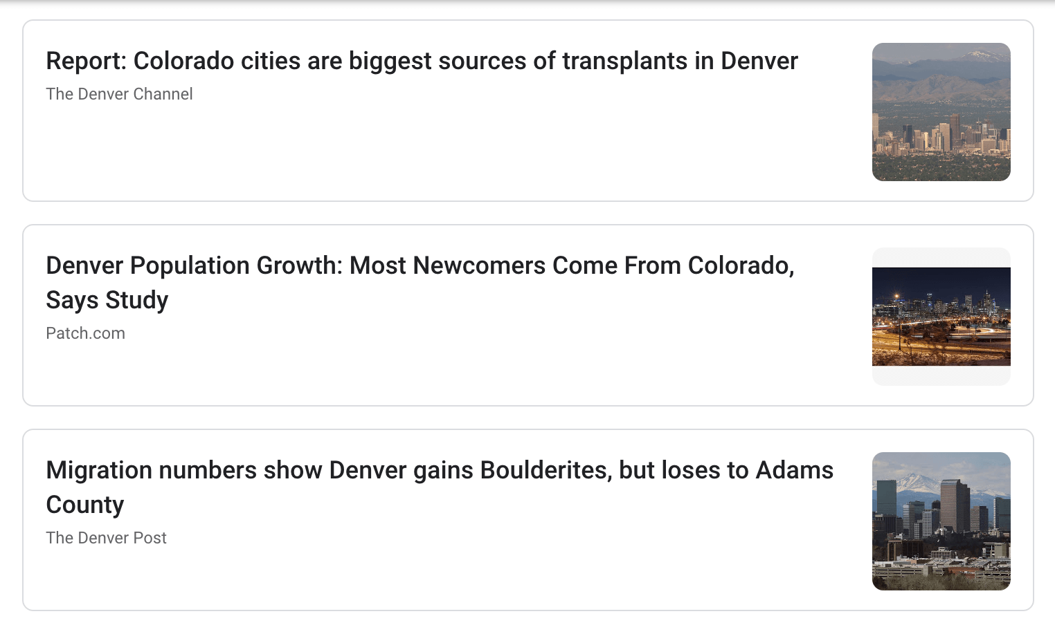
The result? Several mentions from reputable local news sources in Denver – exactly the types of local links an on-demand lawn care company is looking for.
This is an example of how even companies in extremely boring industries can earn links from good content.
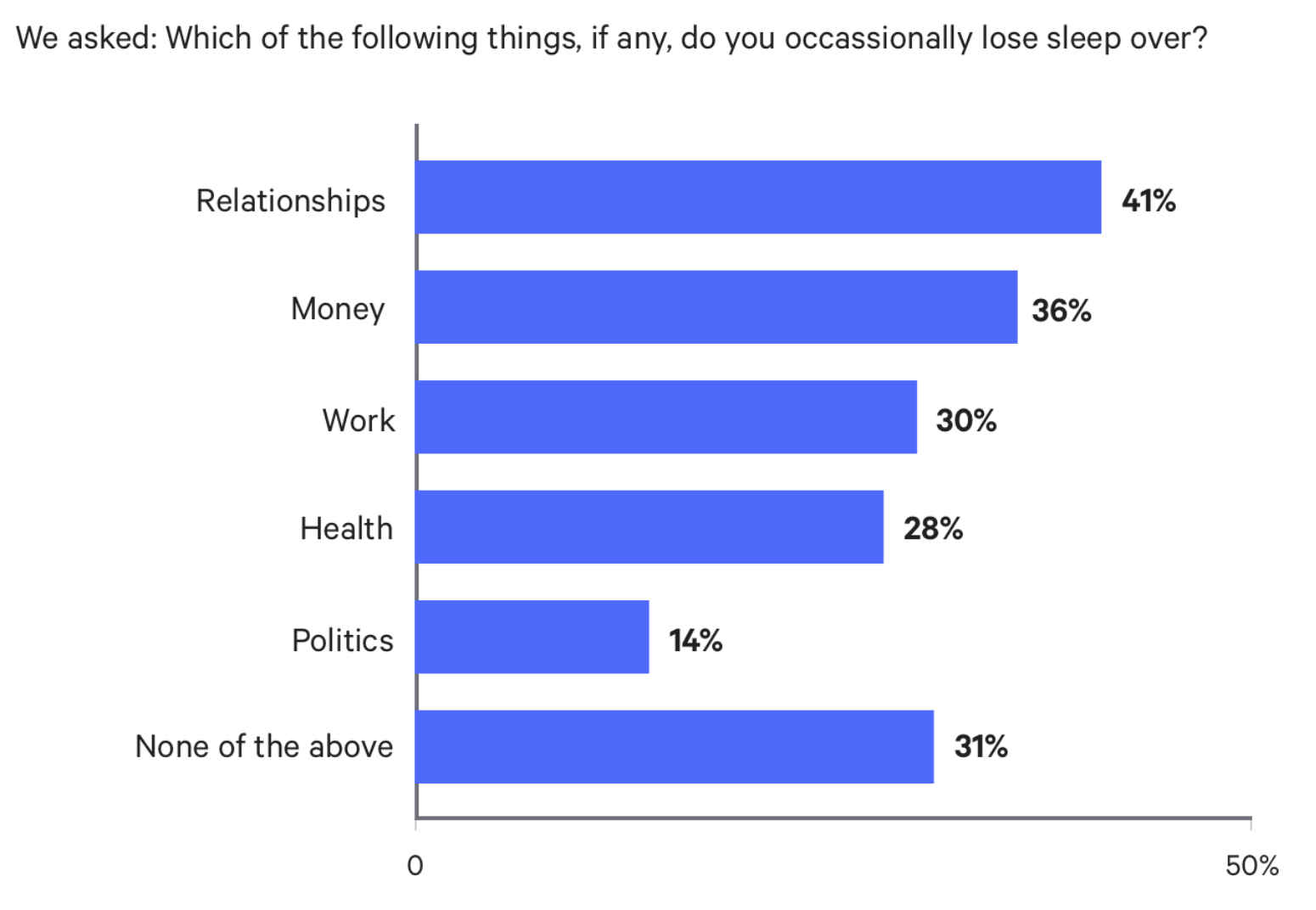
6. “This is the No. 1 reason Americans are losing sleep” by Bankrate
Bankrate built an SEO empire in the personal finance space.
This is one of many surveys the company has done via a research firm, in this case GfK Custom Research. The piece begins by answering the question of what keeps Americans up (spoiler: it’s relationships), then breaks the data down by generation.
The beauty of surveys is that once performed, they are typically fairly easy to assemble into a piece of content. Use tools like HubSpot’s online form builder or a survey tool to gather results, and then simply put the results in a clean chart, cut the data in a few interesting ways, and add some color commentary to make the piece readable and interesting.
The downside? Surveys cost money, and sometimes they don’t yield anything surprising, controversial or otherwise newsworthy.
If you don’t have much proprietary data but money isn’t an issue, hiring a research firm to do surveys can be a great way come up with brand new insights that earn links. On a bit of a budget? You can do surveys via Survey Monkey or Google for a lot less, but more established media outlets probably won’t bite.
7. “Finding the best burrito in San Diego” by The Data School
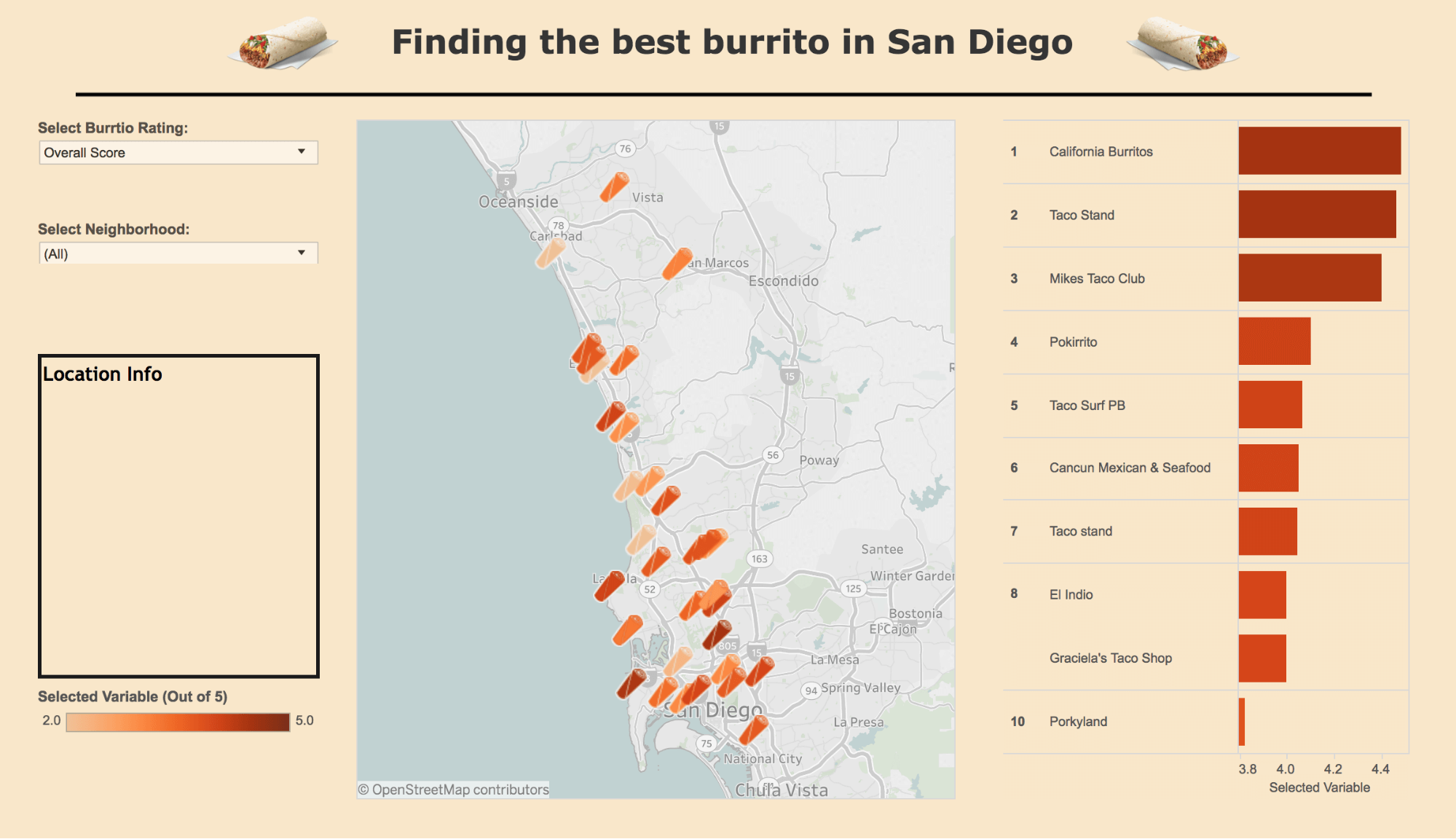
I don’t think The Data School – a UK-based company – had SEO in mind when one of their members created this visualization of the best burritos in San Diego. Talk about out of the box thinking here.
Here’s the explanation according to the author:
“The viz is split into 3 main parts. On the left there are a couple of filters that allow you to select what you want the burritos to be rated by. There is an overall score as well as specific variables such as meat to filling ratio, flavour synergy and uniformity. These are all rated out of 5 so an average can be taken and accredited to the burrito vendor. There is also a neighbourhood selector so you can drill down to find the best burrito shop in the neighbourhood you might be in.”
Will Griffiths describes the project as the week’s “viz at home”, and says that it was inspired by some of his classmates’ trip to San Diego.
Just goes to show how anybody can come up with cool insights from publically available data.
8. Plain Text vs. HTML Emails: Which is better?” by Hubspot
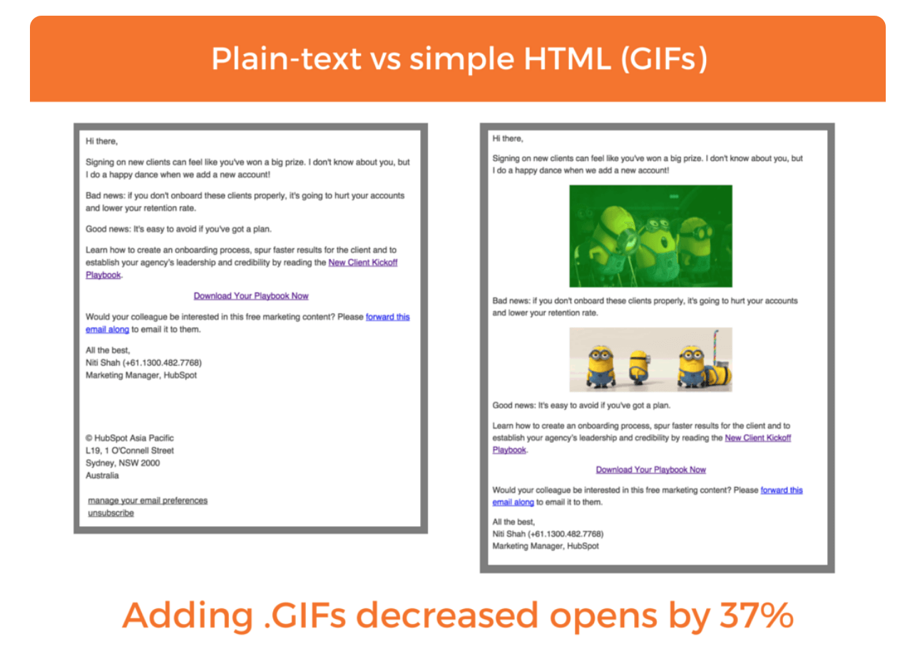
Hubspot revealed some of its own marketing test results in a 2015 piece titled on plain text vs HTML emails.
The post contains around 1,200 words and a handful of visualizations delving into the results of an A/B test the company ran with regard to email.
The post contains one surprising finding: plain text emails tend to outperform HTML emails, despite consumers’ alleged preference for the latter. This piece is useful, surprising and perfect as a source for others to cite, which is probably why it earned 300+ linking domains.
Conclusion
Hopefully, this post has shown you the power of data-driven content as it pertains to SEO. In case you’re looking for more inspiration or datasets to play with, here are some of my favorite resources:
- Web Scraping
- Data.gov
- Google Trends
- Google Dataset Search
- Data is Beautiful (Reddit)
- Tableau Public
- Data.world
- World Bank
- FiveThirtyEight.com (datasets on Github)
Have a cool data-driven piece of content to share? Drop me a note!

White Labeled and Branded Reports. Drag and Drop Editor. Automate your SEO, PPC, Social, Email, and Call Tracking Reporting.