


There’s a current Web design trend that’s disadvantageous to your overall success on the Web. It’s called one-page websites – sites that only have one page and instead of linking to internal pages, just scroll when you click on the navigation.
Single-page websites are neither findable nor sharable, and the user experience of unexpected scrolling is questionable at best.
Cool web design trends
After 15+ years in online publishing, I’ve seen plenty of so called cool web design trends. Do not mix those up with Web design best practices. When it comes to user experience, most trends end up being toxic. They are just expressions of failed artists who became Web designers because of the money.
Trying to introduce Web design trends on websites is like tuning cars. It’s not design, it’s styling.
It’s about looking flashy not being useful. Sadly, each year we witness new arbitrary and often bizarre trends. A few years ago it was about adding fake 3D effects to everything. Later it was about using grungy background textures. These days it’s about single-page websites that scroll on click while website elements move randomly.
Fatal findability failure
A website usually consists of at least several pages. You could argue that it’s more findable when every single page is merged into one. The site consists only the homepage and contains all of the content. So you don’t have to leave the homepage by clicking on an internal link. Hooray! Everything is right there where you need it…or is it?
My very first homepage was built like that. I did it in 1999 using Windows Notepad. I didn’t even know how you can add additional web pages. I just started creating my homepage and was happy. I smooshed some additional content above the old one or even below it and ended up with a solution you had to scroll through to locate each part. That’s basically still the concept of single-page websites. They attempt to be everything at once:
- the homepage
- the services page
- the about us page
- the contact us page
and so on. However, they ignore that each of the pages have a different use case. For example when you are looking for a way to contact a company, you don’t want to scroll through an entire website.
Remember that most people use Google for navigational search. That’s why [facebook] and [facebook login] were the most popular search terms for years.
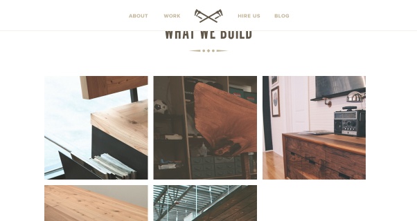
In order to demonstrate the problem to you, I’ve chosen one of my favorite single-page websites. I didn’t choose it because it only has one page, but because of the appearance in general:
- the typography
- the images
- the dim colors
- the look and feel.
Despite the fallacy of the single-page Web design, I still like it:
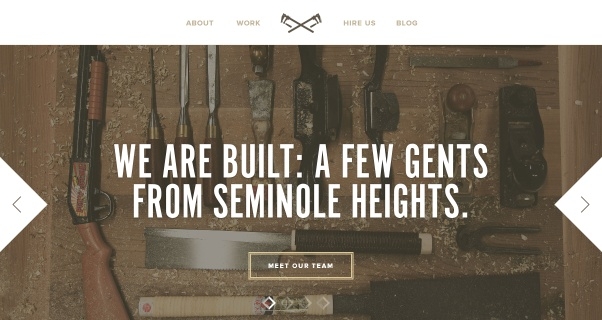
It’s the site of Built, a custom furniture shop from Florida. It even ranks well in Google for it’s most logical local search query [furniture seminole heights] thanks to the optimized page title. However, look at what happens when I search for [built things contact] on Google.com:
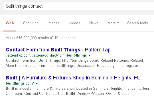
Not only do they get outranked by the Web designer of the site – who shows off the contact form he crafted and coming in #2 – the link Google offers is of course the homepage. When you click it there is no Contact us link in sight.

So what do you click? About? Hire us of course. Then you find out that the form is limiting the choices. You can use it only for hiring them.
When you scroll a bit you will find the phone number and mail address finally in tiny type, ALL CAPS and low contrast. Yes, that’s bad for readability:

What happens when you click it? Your mail program starts and the pre-entered email address is completely wrong.
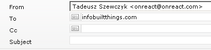
While the web designer was keen on creating a cool web design, he didn’t care much for the “details” like a correct mailing address or even an easy way to find it. Apparently contacting the business is a mere afterthought.
Not all people want to fill in a large contact form demanding a lot of information (budget, project description etc.) Many visitors are using mobile devices and just want to find the contact info quickly to call or mail you.
Compare it to a site you might know as a Squawk reader. I searched for [raven contact] and what did I find:
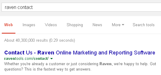
When you visit the page you see the contact form right away. The form can be used by all people, not only potential customers.
Shocking shareability shit
Oh my! Did I say “shit”? Yes, it’s shocking. I know. Guess what, an article mentioning the word “shit” is still more sharable than the average single-page website. I am one of those people who waste their time with sharing other people’s content. Yes, I share content out of admiration and completely selflessly in many cases. However, I also share things to build my brand and the likes, but in many cases I just want to show others that something or someone rocks. When you hide your content on a single-page website using “parallax scrolling” you make it very difficult to share your awesome content or work.
So let’s say I’d like to share the Merchline conference table by Built. On a sharable website I’d expect to click on a link or two and end up on an URL like
buildthings.com/work/merchline
or even better optimized for findability
builtthings.com/furniture/merchline-conference-table
What happens on the actual Built site? When I click Work some fancy automated scrolling occurs and I end up being on
http://builtthings.com/#1
Try typing that in your browser address bar and you’ll end up on top of the homepage.
What do I actually see when I click on Work in the menu?
Apparently the scrolling hasn’t worked out correctly on my browser. When I click one of the images an even more intriguing action takes place. Elements are moving around and transitioning in unexpected ways. It’s like special effects for a movie. The URL still says:
http://builtthings.com/#1
when I click on the actual table thumb and view the Merchline project description.
Searching on Google for [merchline conference table] results in buildthings.com on #1, but on click I only land on top of the homepage again. That’s a bounce. I return to Google.com to search for more and there on #2, I find a Pinterest pin by Built themselves. They uploaded it manually though so that it doesn’t link back to the project or even the website as a whole:
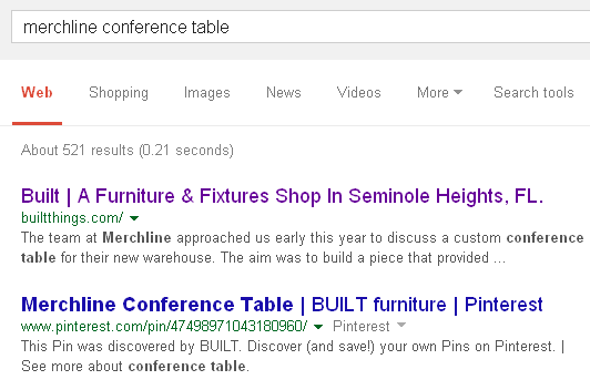
Please note how well optimized the title of the Pinterest pin is in contrast to the single-page website of the actual business. Built is lucky to be a popular site on many Web design showcases and blogs. Otherwise Pinterest and other sites would outrank them for their own products.
Create an extra page for your “work” and another extra page for each item. This way your site will work both on social media and search. It will be both findable and shareable. There is no need to hurt your business on the Web by trying to look “cool”. All the major design elements of the site, the clean fonts, the smooth colors and the attractive images can work perfectly on a site that consists of several sub-pages.
Yes, there are complex ways to tame “parallax scrolling” single-page websites and to mimic real pages in order to rank on Google correctly.
Why design a broken user experience only to work around it after the fact? Like many other fads – think all-Flash websites – this trend will one day be forgotten and only laughed at. Until then make sure you don’t limit your reach on both search and social media by creating a one-page website.

Now social media marketers can get the credit they deserve by automatically delivering Facebook, Twitter and LinkedIn reports that prove value.
I think one page sites have their place, but like most web trends, they get overused and shoved into places that don’t fit. I wonder, however, if single page sites are a counter to thin content issues?
(side note: I built Squawk and I live a few mins away from that furniture place. and damn they make nice stuff)
Yeah, IMHO dedicated landing pages are a good use case and work best without internal clicks. Making your whole site a single-page one is like using a unicycle to bike to work.
The thin content issues are even worse on one-page sites because such a site is not relevant for any single keyword. Each part of it focuses on different keywords and topics usually.
Very good article. A lot of new sites are designed as a one page – landing page. And doing seo for them is difficult.
Thank you for the feedback. SEO is indeed a pain for such sites.
I was searching for a product this weekend, and the #2 ranked result was – in a way – like a one page site. I searched for garmin 620 and got this result: http://sites.garmin.com/forerunnerCoach/
Take particular notice of the bookmark links (team, 620, 220 and connect). All of them work perfectly and go to the appropriate place on the page.
Admittedly, this was really more of a landing page than a true one page site. And there is no doubt that it gets its strength from the main domain, internal and external links, backlinks and relevant content. However, from a user experience perspective, this acted and felt like a one page site.