


So you’ve got yourself a bunch of data because you know data is what makes the modern world go round…but now what? How do you know how you can present your data?
How can you evaluate whether you could present data better? You could always check out some inspiring data visualization examples. Regardless of the visualization method, you need a strategy for visualizing, interpreting, and surfacing the right data-driven insights.
Our Data Measurement Strategy? High/Low
Well….We’ve been telling our clients:
Data is cheap. What you do with the data, the analysis and resulting actions, is what really matters.
Strong analysis is founded in a sound data-driven methodology. And when it comes to SEO data, the preferred sources of information are:
- Google & Bing Webmaster Tools
- Google Analytics
But Mike, you said the data was cheap! What’s your methodology for actually pulling super actionable SEO opportunities out of Google Analytics?
If you’re reading this post, you’ve also likely read Avinash Kaushik’s Digital Marketing and Measurement Model post (if not — read it immediately after this story).
When it comes to pulling actionable insights out of SEO data, we highly recommend building out a measurement strategy to help set ‘bumpers’ (bowling analogy) for the following:
- Identify the business objectives or macro goals that affect the business
- Determine Key Performance Indicators (KPIs)to measure impact against
- Identify target goals for KPI’s and objectives
- Clearly outline the segments that you will measure against, in this case just organic search engine traffic (SEO)
This is one of the first exercises we perform every single time we onboard a new SEO client. It is critical because this clearly establishes the business objectives, KPI’s, target goals and the segments that will be measured within your organization.
Following the measurement strategy being presented and agreed-upon, there should be ZERO confusion as to the objectives of your SEO activity. NONE. ZILCH. NADA!
Once we have our measurement plan in place, we’ll create dashboards in Google Analytics, Raven Tools or Cyfe that help outline all our KPI’s so we can focus on analysis and actions, not the tedious and mind-numbing process of trying to pull data out of various systems simply to get to the analysis exercise.
Here’s an example of an SEO dashboard that featured Google Analytics data piped into a Raven Tools report for one of our e-commerce customers.
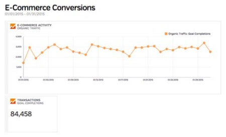
Over the past few years, we’ve developed a solid analytics methodology: This client (who only sells one item at a set price per unit/SKU) should pace at approximately 2,500+ transactions per day for a total of 75,000 transactions from search engines every single month. Using the dashboard above, we can quickly figure out if our revenue is pacing appropriately, higher or lower than expected with a simple view.
That represents data neatly compiled into a dashboard that represents our KPI’s. But how do you actually analyze this data to get some actionable insights out of it?
The Pairwise Comparison: An SEO’s Best Friend
Using our measurement strategy, our first step is to perform what we call a High/Low analysis. Specifically, this includes:
- High-level or macro view: Is performance up or down?
- Low-level or micro view: Okay, now why is performance up or down?
Answering that question is the key outcome of a strong analysis methodology. And our favorite way to go about answering the ‘why is this happening?’ question is to use the Pairwise Comparison technique.
Also known as a Paired Comparison Analysis, this strategy helps SEO analysts do one of two things:
- Make it easier to choose the most important problem to solve, or…
- Pick the solution that will be most effective
In plain English: we use pairwise comparison analysis to answer the question What is different here and why?
More specifically, our team likes to perform a pairwise comparison at three time-specific intervals:
- Month-over-month
- Quarter-over-quarter
- Year-over-year
1. Month-over-Month Pairwise Comparison
Definition: Looking at last month’s data compared to the 30 days prior. For example, looking at February 2015 data versus January 2015.
Pros: A month-over-month comparison is super handy to see how revenue, leads, etc. are currently pacing through the quarter. This allows you to see if KPI’s are on track, behind or ahead of the curve.
Cons: A finite amount of micro-level data should not be used to make sweeping changes to a website, application or product. Often seasonal elements or one-off promotions can throw off granular-type analysis. Keep this in mind.
A use case for this type of comparison: Make small directional tweaks and pivots based on a month-over-month comparison.
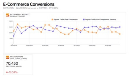
In the dashboard example above, check out a month-over-month pairwise comparison for our e-commerce customer between January 2015 and December 2014:
Now remember, your objective during the analysis process is focusing on What happened, why and what are we going to do next?
For the example shown below, we see fairly steady e-commerce activity month-over-month when it comes to traffic, but the transaction count is down month-over-month. A deeper dive reveals that January 2015 produced just over 8% more transactions per day; even though January was a longer month, the per-day pairwise comparison shows us that February was still a down month.
2. Quarter-over-Quarter Pairwise Comparison
Definition: Looking at the last fiscal quarters data compared to the quarter prior. For example, looking at Q1 2015 data versus Q4 2014.
Pros: A quarter-over-quarter comparison is a better barometer of how your projected growth is doing — you have three times the data compared to a month-over-month comparison! Additionally most publicly owned companies report growth on a quarterly basis, so you have the added benefit of falling in line with the pre-determined SEC reporting schedule.
Cons: While you see a larger amount of data as well as statistical significance, you’re beginning to pull out of the weeds here. Be wary of missing a key insight at this level because you’re flying a bit too high in the clouds.
A use case for this type of comparison: Use a quarter-over-quarter comparison to identify the high-level source of an event (positive or negative). Then dive into the details at a monthly, weekly or even daily level.
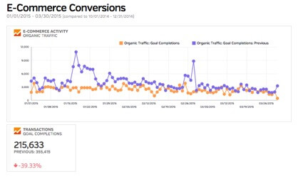
For the example shown above, we see multiple revenue and product trial spikes from search engine traffic when comparing Q1 to the quarter prior (Q4).
The difference in revenue could be explained by different promotions or seasonal offers, as Q4 shows multiple revenue spikes around key e-commerce holidays as well as promotions for Christmas. As for the dip in product trials, that could be explained by a tracking issue and digging into those specific dates would be helpful to understand where the problem came from.
3. Year-over-Year Pairwise Comparison
Definition: Looking at the last year’s data compared to the year prior. For example, looking at Q1 2015 data versus Q1 2014.
Pros: An analysis like this will quickly answer the question Are we growing our revenue or not? This type of analysis is the answer your traditional CEO or CMO’s question: “Are we up or down this year?”
Cons: Looking at year-over-year comparisons sometimes isn’t fair. Often promotions happen at different times (if at all) one year to the next, seasonal factors could be different (imagine being a beach resort in Florida – one year there’s a hurricane, the other there is not. Yikes!) or any number of elements at play could be different.
A use case for this type of comparison: This is an executive level question. Treat it as such and bring out the 72-point font in your presentations to show how you are doing.
As you can see from this lengthy post, there’s no shortage of data available to the smart online marketing who wants to know at a granular level what’s happening with a website. The real challenge is in interpreting that data with the right business goals in mind.

Learn About Our Backlink Tools
Backlink Explorer lets you see who is linking to any website – either yours or your competitors.