


It’s hard to be an email marketer.
Copywriters have to grab attention in cluttered inboxes with original-yet-proven-to-work subject lines. Designers have to keep attention despite compatibility issues that take coding right back to 1998.
And when major retailers have to start sending campaigns like this, you know those new Gmail tabs are really making life miserable for email marketers.
So it’s understandable that email marketers want to try something that seems fresh and fun. Something that people like. You know, something like animated GIFs.
If big retailers like Sephora are doing it in their email newsletters…

…why shouldn’t everyone else?
Here are three good reasons why not to use animated GIFs in emails:
1. It’s a trend.
The first person to use an animated GIF in an email marketing campaign was original. (Maybe.)
The next 50 people to use an animated GIF in an email marketing campaign probably thought they were doing something original.
The next 5,000 people to use an animated GIF in an email marketing campaign were just hopping on the trendy bandwagon.
You know what else is/was trendy? Powdered wigs. Jello-O salad. Saying “groovy.” Drop shadows and beveled edges and rounded corners in graphic design. You get the point. It won’t be long before this new technique loses its trendy appeal as tastes change. Best case, it gets quaint, like “groovy.” Worst case, it turns readers off.
Most likely case? They’re going to start to ignore it.
This trend started sometime last fall, accelerated around Christmas and trickled down from major retailers to smaller shops this year. How long before ennui sets in? Email readers will see it as decoration, not something useful.
Which brings us to…
2. It’s not useful to customers.
Have you seen an animated GIF in an email designed to be useful to an email reader more than it seemed designed to attract attention?

You could argue that that’s what visuals are for: to attract attention. OK. I’m listening. And I have a soft spot for using elegant cinemagraphs in marketing.
But using an animated GIF to cycle through different colors or views of your product does not make your product look more attractive. It means you weren’t able to take one compelling photograph of your product. If you can’t sell me in a single image, what makes you think you’ll sell me in three or more?
I can hear some of you now: “Well, you can see it from all angles. That’s useful.” Well… not really. I can’t pause your GIF to take a longer look at a particular angle or zoom in for a closer one. That’s frustrating.
Then there’s the camp that says, “Well, you can see the product in action. That’s useful.” Hmm. OK. I still can’t pause your GIF or slow it down for a longer look. So we must be back to getting attention by seeing a product in action.
But is it a product customers really want to see in action?
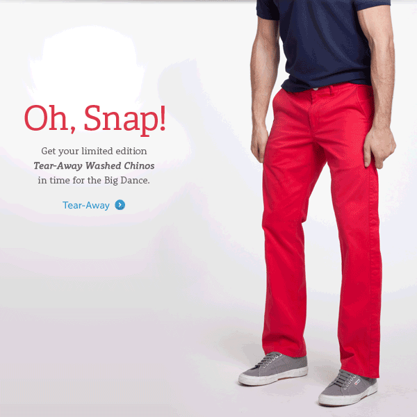
Even if it is, could someone please tell me how those pants get back ON that guy so fast?
Other executions that aren’t particularly useful:
- Animated GIFs of multiple new products. OK. You have lots of new products. You want to show me as many as possible as fast as possible in case one of them catches my eye. Let’s say one does. Can I go directly the item I want when I click on it from the GIF? In cases like this, nope:
 Besides, smart marketers already know what’s most likely to attract me based on my previous purchases. Take a dramatic photo of that and tell me there are nine more great products to see, too. Mystery, ya know? It works.
 - Animated GIFs that distract from the item for sale. Twirling is really important to sell a pair of boots. Yes, twirling.So is moving your feet. Apparently.
- Animated GIFs that are unnecessary and ugly. Retailers aren’t the only ones playing with animated GIFs. One B2B company wanted me to know that I could watch a webinar about landing pages on any device.Without this large, ugly GIF in their email, I’m not sure I would have been able to figure that out.
- Animated GIFs of wiggling products. A plate does not wiggle on my kitchen table. Why does it wiggle in your email? Oh, and why did you wait 7 seconds to make it wiggle? To freak me out? If so, it worked.
 Besides, smart marketers already know what’s most likely to attract me based on my previous purchases. Take a dramatic photo of that and tell me there are nine more great products to see, too. Mystery, ya know? It works.
 So is moving your feet. Apparently.
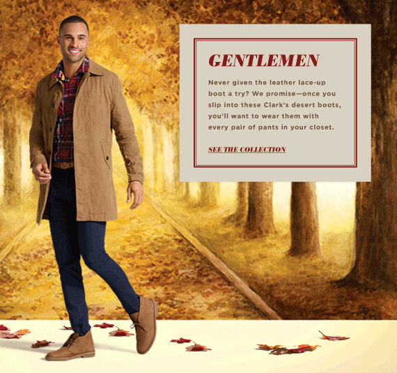
If you can’t justify using an animated GIF in an email for any other reason than “it looks cool” or “it gets attention,” don’t use it.
3. It’s a bad call to action.
This is the most grievous sin of animated GIFs in emails.
Let’s say that you want to join the trend and you have an excellent execution plan. Your animated GIF is going grab attention subtly and be helpful and useful to your audience.
OK.
Is it going to drive click-throughs? Will those click-throughs drive conversions?
If the primary purpose of an email is to get your reader from the email to a targeted landing page — and it’s the landing page that’s optimized for conversions — your animated GIF needs to be a CTA in itself or less prominent than the email’s primary CTA.
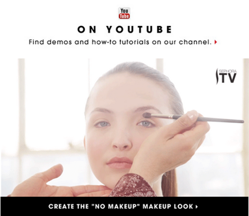
If it’s a CTA in itself — as Sephora’s was; one click on the animated GIF took you to a YouTube video about eyeshadow application — then make sure the animated GIF isn’t so short and repetitive that it looks weird — as Sephora’s did. You also have to beware garishness. >How much is too much?
If it’s less prominent than the CTA, or doesn’t drive email readers to click the CTA, then we’re in “What’s the point?” territory. Take this example. The animated GIF is subtle and fitting for the ModCloth brand, which is known for experimenting in emails.

But why do the lights blink up when the CTA button is down? And why is there is there a horizontal line dividing the image and the CTA?
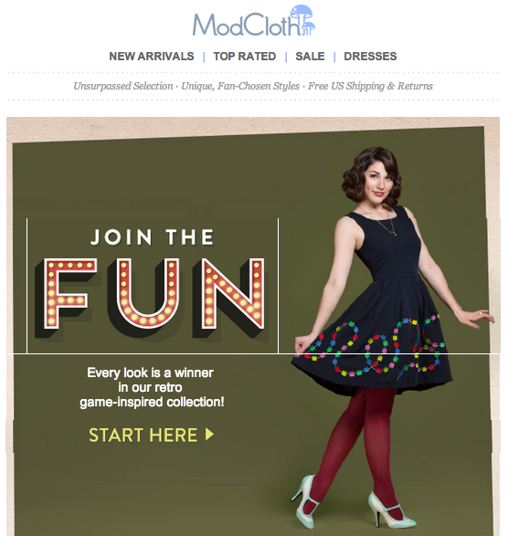
Better design choices could have made ModCloth’s animated GIF more effective at pointing people toward the email’s CTA.
How long someone spent looking at my email’s animated GIF tells me nothing (and it’s not measurable anyway). How many people clicked through and ultimately purchased my item — those are the kinds of email marketing metrics I want to report.
Make it a rule
Don’t want to worry about any of this? Simple. Never use animated GIFs in emails.
Of course, that’s easier said than done. So:
- When a copywriter or designer suggests one, ask how they’ll overcome these three very good reasons for not using an animated GIF.
- If you see a cool example in your own inbox that tempts you, don’t suggest doing the same unless it caused you to purchase the item (or take whatever the primary conversion goal of the email was). Even then, make sure that imitating your example makes sense for your brand’s product.
- If a manager or client “requests” an animated GIF in an email, and “requests” = “commands,” take heart. They could have asked you to include a QR code.

Analyze over 20 different technical SEO issues and create to-do lists for your team while sending error reports to your client.
I agree! GIFs in emails are terribly distracting, I pay more attention to the movement than I do the actual marketing copy.
I completely disagree. When used well, they can be very effective. That’s the key – doing it for a purpose, rather then just because someone’s figured out how! The above are a lot of examples of badly executed animated gifs. You might as well pick some from the 90s to demonstrate how ‘bad’ they are.
I’ve seen great retail emails that show two different items within the same space (ie image changes completely), or see an item from different angles. Pizza Express did a very subtle one of a candle flame, I didn’t even notice it at first, but when I did, it was just beautiful.
Sharon, I agree that something should be done for a purpose— not just because it’s possible. You’re right about these being badly executed animated GIFs. I have been collecting these since first noticed them last fall. I haven’t observed marked improvement in quality, only a marked amount of quantity. At least in my inbox, ineffective is the norm.
I disagree that showing two items in the same space is effective for the reasons I mentioned above. The animated GIF format simply does not allow me (the customer) to click on the item I want, specifically. Perhaps a landing page that shows both items would help, but again, that’s two clicks—one on the GIF, one on the landing page to the item I want to know more about—when one could have done the trick. Also, the animated GIF doesn’t tell me (the email marketer) which item, exactly, people were most interested in. There’s a lot of drop-off in metrics between clicks in the email and clicks in the landing page, so I can’t count on the landing page metrics being a true indication of interest.
As far as multiple angles of the same item— so far, I haven’t seen anything that made me go, “Hmm. I want to buy that now that I have seen the back side of it.”
Leaving aside the argument against animated GIFs in emails, I totally need a pair of tear-off Chinos. “Slipping into something more comfortable” after a long day of work has never been so easy. Or fun.
If you do… please, please create an animated GIF and send it in 😉
DEAL
Dear Arienne,
Ordinarily I agree with you on every count, and I do in this case with all points but one:
My inbox needs MORE gifs with guys ripping off chinos “in time for the big dance.” Perhaps they could mix it up a little and make some blue, or black, or gold lamé.
Otherwise, yes, yes, and yes. Turn off your blinking lights and let me click your buttons without going into seizures.
Warmest regards,
Jess
Dear Jess,
I’ll see what I can do.
Still laughing,
Arienne
If I could get on that pants-off mailing list as well, I’d appreciate it.
I want to make an animated QR code Gif and spam it all over Pinterest. And maybe Instagram.
I support that.
Nice Post.
valuable information here.
Thanks for sharing with us.
Your post made me smile. Not because I agree (I don’t), but because it’s such a classic case of once more pooping something categorically that is so clearly simply a matter of “do it right and you can add value”.
I can pull out examples for every possible misplaced use of Flash, personalisation, embedded brand font, sound/music on load, phallax scrolling, horizontal animation, mobile responsiveness, video tutorials (tell me when to stop…) — all of it was at one time a trend that everyone was trying out and many were failing to do it right.
But dissing a method entirely is stupid, narrow minded and ignorant. Pulling out a bunch of bad examples to pseudo-proof a general point is rather cheap. Don’t you think?
http://www.youtube.com/watch?v=1vBesOFURek
Isn’t everything a trend? Isn’t it better to be trendy (within your target audience) than not?
Hmm.
Think about Upworthy. It was crazy popular with a target audience. Then, the style of Upworthy videos and headlines became trendy. CNN starts doing it. Then, someone makes a Downworthy plugin (http://downworthy.snipe.net/). Who knows how long this trend will last?
If you’re the inventor of a marketing style, own it. If you’re mimicking it, ask yourself why. If you and a thousand others are mimicking it, ask yourself if you really stand out any more.
I can’t agree with you. This sounds like your opinion, but I wouldn’t make it a rule.
¿¿” Simple. Never use animated GIFs in emails.”??
I agree with @EmailChicGek:disqus and @nadjavonmassow:disqus arguments.
For example, as a reply to the 2nd point, what would you say about this? http://www.marketingsherpa.com/article/case-study/gif-centric-email-campaign