Photo credit: Flickr
It doesn’t get talked about as much as links or on-site issues, but being able to navigate around a website is incredibly important when it comes to SEO.
No user wants to click on a site only to get lost trying to find how to make a purchase (and I will take a leap here and assume that companies don’t want that, either). Google definitely wants all its results to be easy to use.
Website navigation is a big topic, but it doesn’t have to be too complicated if you break it down into parts.
There are several different components that go into creating good navigation, and most of the navigation changes can take effect immediately to start benefiting your site right away. Here’s a look at the biggest elements to consider in website navigation.
Website navigation and linking
Linking (and how to go about linking) is probably one of the largest aspects of website navigation. There are several different ways that linking can help your navigation, and some are better than others. The types of linking include:
- Internal linking. This is essentially linking to another page of your website on one of your other webpages, which you can learn more about here. This is probably the most important type of link when it comes to navigation. It helps people find related articles and topics without have to browse through any archives.
- Horizontal linking. This happens when you link to related products. The best example is probably YouTube where you see related videos on the right side of the page. This will usually only benefit huge websites such as YouTube, but it’s something to consider if you’re a site that offers many different products. Some also consider a “related articles” plugin to be horizontal linking. Below is an example of horizontal linking:
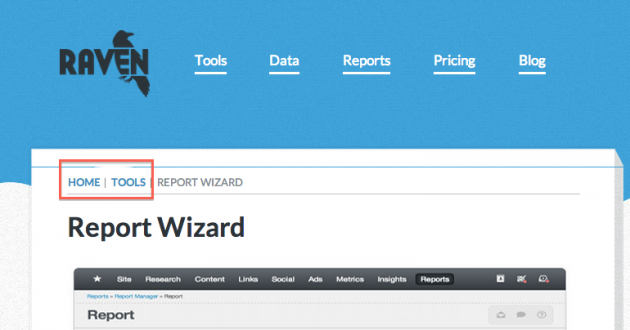
- Vertical linking. Vertical linking is a way of displaying the overall structure of your website. The most popular example of vertical linking is breadcrumbs, which are essentially just little links that show up at the top of a page and remain static on every webpage a user visits. If a user needs to go back or needs help figuring out where they are, the breadcrumbs are there to help. You can usually install with a simple plugin if you’re using WordPress. Below is an example of breadcrumbs on Raven’s website:
Website navigation and categories
Creating different categories in order to help keep your pages and content organized makes linking and overall navigation much simpler, even for the most basic of websites.
When deciding how to break up your website into different categories, you will want to follow five steps:
- Determine the keywords or phrases your audience might use when searching for something on your website or when searching for your website in general.
- Determine what pages on your website are getting the most traffic.
- Group similar pages together. You don’t want to segment them by how much traffic they get, but do keep this in mind because putting these pages at the top is often a good idea. It’s also OK to put one page into two different categories if appropriate.
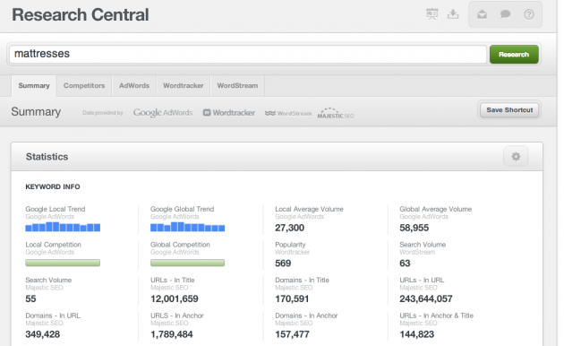
- Use tools like the Google AdWords Keyword Tool or Raven’s Research Central to help determine the popularity of your keywords as you create
- names for each of the categories.
- Put the categories onto your website. If your categories are along the top, you should probably stop at about five to seven, but down the side you can have as many as will fit (usually no more than 15).
Your intuition is usually right when it comes to creating categories. You know how to split your website up better than anyone; but it doesn’t hurt to do a little bit of keyword research to give you some real numbers as to what works best.
Navigation through filters
Filters are an easy way for users to sort out all of your information.
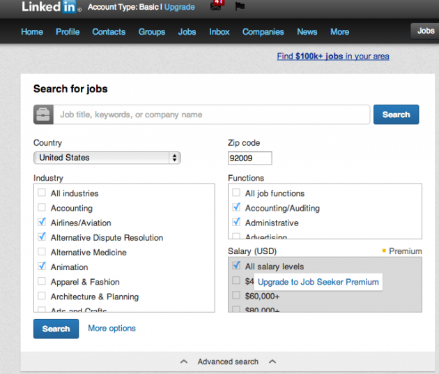
You might have great categories and great breadcrumbs, but sometimes users already know exactly what they’re looking for. They want to be in control of how they sift through your information. Filters are the perfect way to make this happen.
LinkedIn is an example of a site that utilizes filters:
When it comes to actually creating filters, your developers have two options: Create an order for the filters by creating duplicate content, or decide not to index the filters.
This gets into some pretty complicated stuff if you’re not a developer, but you can visit the Tableau software website to learn more.
Do you have any tricks when it comes to navigation? What tools have worked best for you? Let me know your thoughts in the comments below!

Analyze over 20 different technical SEO issues and create to-do lists for your team while sending error reports to your client.


