The past several months we’ve asked our customers a lot of questions (perhaps you were one of them). We also studied which features they use the most, and took note of the ones they use the least. After we crunched and analyzed all of the data, the results showed us a clear path for changes we knew would delight our customers.
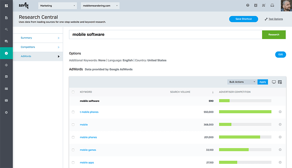
Armed with data, we rearranged the order of our tools in the navigation menu to provide quicker access to the tools people use the most often. Not only is it beautiful and fun to use, it also gets out of your way when you don’t need it. The result is more horizontal space to view and work with your campaign data.
New Style, Same Tricks
The tools our customers have come to love using haven’t changed, they just look a bit more modern. The top bar, just like the new navigation menu, has the same options. The biggest change is that some options have moved, but they’re all still there.
Quick Filter for Profiles and Campaigns
Many of the agencies that use Raven manage a lot of clients and campaigns. With this update, they can now quickly filter and switch to different Profiles or Campaigns.
Add Another Custom Widget
Raven’s WYSIWYG report builder provides pre-configured widgets to make it quick and easy to build any type of report. It also has an advanced option for every data connector to create and customize report widgets. Before this update, you had to pick a data connector like Google AdWords or Facebook Ads, create the custom widget and then start over. With this update, you can now choose a data connector and continue adding new custom widgets from it without starting over.
There’s never been a better time to use Raven. If you’re not a customer and you want to check out what’s new, signup for our free 14-day trial.

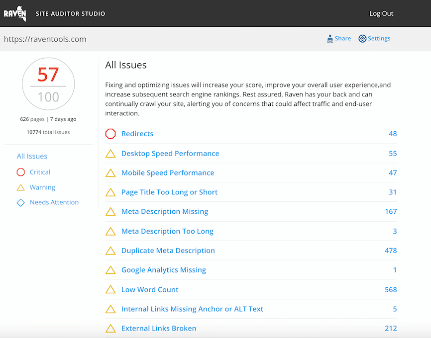
Analyze over 20 different technical SEO issues and create to-do lists for your team while sending error reports to your client.


Thank you for sharing the great article…..
Nice article….Very good information