


A successful infographic comes down to four things: a great idea, detailed research, excellent production and intelligent outreach.
While there are four parts to a successful infographic, the research forms the very foundation of the content piece. Without it, the whole thing can fall apart. Unfortunately, often it’s the bit that is completely neglected.
That isn’t necessarily true of the other elements; for example, we have all seen really poorly designed infographics perform well simply because the idea was strong and the research was solid. I’m not trying to argue that the other things don’t matter, but I am trying to convey just how vital getting the research right is.
In a recent guide, I identified the key tenets of good infographic research:
Secure up to date and verifiable facts from reputable sources.
Identify what makes your audience tick and aim to highlight the data and content most likely to trigger an emotion or reaction.
Think how the data could look visually — nobody wants a graphic that is too text heavy.
Let’s explore these research tenets in more detail.
Find your sources
Primary sources
Primary, research can be a fantastic way of securing press coverage. You can offer completely unique facts and data. However, it is more expensive and time-consuming form of marketing.
That’s why, when gathering primary data, keep these things in mind:
- Look within your business or talk to your clients. There is often a wealth of information locked away in reports, presentations, that customer survey your sales team did and so on.
- Consider tools or services for gathering feedback. Many services out there enable you to elicit feedback quickly and relatively cheaply, leveraging the power of the connected web to bring your target audience to your survey. As Matt Gratt wrote, “tools like Google Consumer Surveys, Ask Your Target Market and Mechanical Turk enable marketers to do academic-quality research in time periods measured in days — using only their credit cards.”
Then augment your own data (as ResearchExplainer suggests) by checking a wide range of other sources to ensure you have all the information, not just the basic facts. For example, you could explore Scientific American, Science News, EurekAlert! or Newswise.
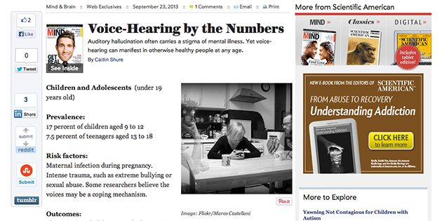
Sometimes data sources themselves cry out for graphic representation, such as this Scientific American by-the-numbers article about auditory hallucinations.
Also, bookmark this reference page now — it lists many Web content sources that can offer background information on the primary source data for your infographic.
Citing sources like these in your infographic can give it considerably more credibility.
Secondary sources
Research gathered through secondary means is usually more work, but it is frequently cheaper. You can often secure excellent levels of coverage for the finished content piece simply by piecing together data into a “packaged story” that can be “sold” to publishers. Also, if you can dig deeper to pull out a good factoid, then you have just as good a chance at coverage with an infographic consisting only of secondary data as you do with one created from primary data.
Good sources of data include:
For more info on each of these sources (and others), see The Data Resources Resource by Sean Revell.
Always look for the most recent data set. Outdated data can hamper the effectiveness of an infographic and could even be damaging to your or your client’s brand if the end result is misleading. Don’t have blind faith in Google’s ability to surface the latest set of results for you. Often a quick search on Google surfaces a data set from 2011 on page 1, but if you dig to page 2 or 3 or even within the result’s website you might find the same study with data from 2012 or even 2013.
Also, be very vigilant in ensuring the validity and authenticity of the sources you are getting your information from. We all know we can’t believe everything we read on the web, but you need to be absolutely certain about the facts that you are associating with your brand or your client’s brand. (That’s particularly true if you want to take your infographic to the big publishers, and why wouldn’t you?!)
A few more suggestions about finding data:
- Dig for data that’s hard to get. Surface the parts of a story that it is hard for others to find.
- Feelings matter. “The more emotion the content evokes, the more viral it will become,” as this infographic points out.
- Read very carefully. Absorb information with care. “Nothing feels worse than working hard on a project, then seeing it picked apart because you didn’t connect the dots,” wrote Josh Smith for Fast Company.
- Don’t be afraid to switch tracks as the research develops. It may become clear that the original story you were aiming to tell isn’t relevant based on the data you have found or that it doesn’t quite tell the story you’d like to tell. Don’t be tempted to manipulate the data or omit important facts, because you risk losing credibility with publishers and their audiences.
- Choose sources who will share. Include some sources that you know you can ego-bait for help in promoting when the infographic is ready.
Reference your sources properly
This comes down to personal preference.
To keep an infographic free from clutter, more often than not you can simply include a list of the source domains (or titles of the reports) at the end of the infographic. Then keep a list of full URLs that you can share with link prospects or members of your audience if they need to verify anything.
If someone makes a particularly juicy or controversial comment, however, consider citing where its source right next to it. This lends credibility to the infographic.
Structure your results
- Title. While you’ll probably have a working title for an infographic project, the best headline usually comes out of the research stage. Either pose a question or highlight one of the most exciting pieces of data.
- Enticing introduction. As part of the research, write up the introduction that is going to sit atop the infographic to get people excited about what they are about to enjoy. Highlighting some of the key facts from your research and including that within the introduction is a good way to encourage people to read the entire infographic rather than just give it a cursory glance.
- Sections. Given that you likely want the infographic to tell a story or make a particular point, then it is important that all of your research is assembled into a cohesive piece. Your designer can do this, or this can be the task of the researcher. The best case might be to have the researcher create a series of sections that the designer is then tasked with bringing to life.
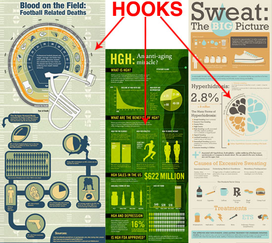
- Determine the hook. Every infographic has a fact or statistic that really stands out and likely bonds the rest of the infographic together. That’s called the hook. At the research stage of an infographic, try to pick out that one fact and help the designer determine what needs to be important when it comes to the actual design. This example, from Smashing Magazine about the Do’s and Don’ts of Infographic Design, can help you and your designer determine the hook:

- Consider the Serial Position Effect. An individual’s ability to recall an item on a list is affected by that item’s position on the list. In short, some psychologists agree that recall is far, far higher for the first and last items in a list (“primacy” and “recency”). It’s worth arranging your research so that the designer puts your killer stuff in the first and final sections.
- Include design directions. It may sound odd to issue advice to a designer when — if you are anything like me — you aren’t qualified to own a copy of Photoshop. But bear with me. During research, you will often find examples of closely related infographics and get ideas for how it could look. Therefore as part of the research document, include examples of infographics that you like and dislike.
Elicit feedback
Finally, you have the research document ready. Now it is time to get some feedback before you whiz it off to your designer.
Feedback sources
From whom should you get feedback?
- Clients/managers. This is obvious, really.
- Brand/legal teams. This is very important.
- Colleagues. They often spot things that you haven’t or identify a different angle or further avenues to explore.
- Prospective publishers. This is most important. You may be pleasantly surprised how receptive prospective publishers can be to you asking their opinion on a piece. This gives you a foot in the door to go back to them when the graphic is ready to go.
It is far easier to have everything in line before you get your designer involved. Then they are working with all the pieces from the start, rather than retroactivity having to add sections after they’ve already sketched out the design.
Quality control
Don’t forget to double-check your own research. After you have received client feedback on the overall direction of the research, have a second person check through the work of the initial researcher. They will be looking at:
- Facts. Are the facts verifiable and 100% accurate?
- Sources. Are they credible? Are there are more credible sources?
- Copy. Is it free from spelling/grammar issues and really readable
- Structure. Is it structured as effectively as possible?
Although you may have a much wider quality control process to assess the infographic for overall design quality and readability, this part of quality control is most important during the research phase.
Remember the research
I have said it before and I will say it again… Do you really want your brand associated with the deluge of excrement that some are predicting for content marketing?
If not, make research the foundation of your work.

Analyze over 20 different technical SEO issues and create to-do lists for your team while sending error reports to your client.
So glad you wrote this! Have recently started to create/play with infographics so its a great resource to make sure my research, structure, etc is on point. Thanks!
This is one of the best articles about creating an infographic I’ve seen. Most just focus on topical content ideas and design concepts. This digs much deeper and provides awesome advice on how to really do the research necessary and execute the process effectively. Well done!
Good stuff. Bookmarking it!